
Saturday, 24 November 2012
Friday, 23 November 2012

Friday, 16 November 2012
Photography Magazine Analysation
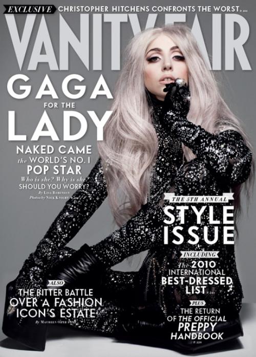
Vanity Fair Lady Gaga Magazine:
Lines and Angles:
 Strong diagonal angle where her hair meets her arm. Then the same again where her leg meets the other side of her hair and they both finish one on top of each other making a meeting point. Short diagonal line with her other arm.
Rule Of Thirds:
Unconventional, there isn't a proper rule of thirds, this fits her as she's quite a original person.

Focal Point: Either her face in that strong pose or her leg which is diagonal through the middle of the page.
The title is straight at the top through the middle, left third rule applies to this as her name and main headlines are down that side, yet also a bit of right third as the theme of the magazine is on the right side.
Source The Game Magazine:
Lines and Angles:
Straight lines down his face until his neck, then it's diagonal of his shoulders down some of his arm.
Rule Of Thirds:
His chin, mouth and nose, it fits well into his face.
Focal Point:
The bottom of his chin and then the gun that's point at it are the things that you focus on first, then the rest of his face and his eyes tightly shut.
It has the title straight through the middle of the top of the magazine and then the left third rule fits here as all the main headlines are down the left side, leaving the smaller ones of the right.
Lines and Angles:
Rule Of Thirds:
Unconventional, there isn't a proper rule of thirds, this fits her as she's quite a original person.

Focal Point: Either her face in that strong pose or her leg which is diagonal through the middle of the page.
The title is straight at the top through the middle, left third rule applies to this as her name and main headlines are down that side, yet also a bit of right third as the theme of the magazine is on the right side.
Source The Game Magazine:
Lines and Angles:
Straight lines down his face until his neck, then it's diagonal of his shoulders down some of his arm.
Rule Of Thirds:
His chin, mouth and nose, it fits well into his face.
Focal Point:
The bottom of his chin and then the gun that's point at it are the things that you focus on first, then the rest of his face and his eyes tightly shut.
It has the title straight through the middle of the top of the magazine and then the left third rule fits here as all the main headlines are down the left side, leaving the smaller ones of the right.
Friday, 9 November 2012

Friday, 2 November 2012
To what extent should magazines be held responsible for the
social ramifications of the representations they offer?
The four magazine covers I analysed for a pre-task were all
aimed at teenage/young adult girls. After comparing them all it really shows
that from reading the type of magazines and articles within, it gives a
perspective over what the ‘norm’ is for girls to look and act like. Social
ramification is the bad effect of doing a certain thing, so when it comes to
reading these teenage magazines this could be things like peer pressure or self
consciousness. When it comes to teenage girls, there’s already a lot of stress
and of peer pressure to have your hair in a certain cut, wear different types
of make-up and wear the best clothes that fits in with your friendship group,
from a young age, girls feel the need to fit into a certain stereotype of ‘pretty’
or ‘fashionable’ and they fear the confrontation that would likely come from
looking or dressing differently than what’s supposedly expected from them. So
when reading the magazines, it makes it that little bit harder. The articles
are almost telling you what to wear, how to apply your make-up and which brand
to get or how to get a boyfriend. One of the worst social ramifications that
magazines represent is weight. The girls that fill the pages are always skinny
and the stereotype of either pretty or sexy and it gives the idea that being
skinny is the normal way and it gives a perception to girls who may be bigger
that being slightly larger is a bad thing, and from this there’s a lot of
problems with teenage girls and eating problems from anorexia to bulimia. But
this is only because the magazines are almost shoving the way people should
look and dress down their throats. The Hypodermic Needle theory comes into this
as teenage girls will believe anything they read and will act or do things to
their body to become this stereotype which isn't what they should be like, only
what girls are expected to become from the lines in these articles. There are problems now with girls as young as
12 and 13 that have been in hospital from eating disorders. It’s not only
magazines that are responsible for these issues, magazines are only a part of
this. A lot of media gives out hidden meanings of ‘the perfect girl’ especially
shows on television, most of them involving stereotypes of ‘pretty’ girls, and
things like ‘America’s Next Top Model’ giving a message that only super skinny,
pretty and tall girls are the right fit to become a model. Also newspapers don’t
help. When it comes to page 3 girls, this gives out more stereotypes a girl
should fit into. The page 3 girls always have big breasts, which for all girls
can make them feel self-conscious if they aren't only enough to produce them
yet or if when they have aren't big enough, which leads to another social
ramification of Plastic Surgery, millions of girls now go through surgery to
get tucks and lifts to get better cheekbones, bums, stomachs and and boob jobs
to go up a size because they don’t believe they’re a normal size because of
stereotypes and perceptions of the normal thing. So the media is defiantly quite
responsible for how children and young adults are becoming, girls are growing
up now self conscious and have a lot of peer pressure to become something that’s
not at all natural which when doing so, can take turns for the worst.
Friday, 19 October 2012

The title is teen-vogue, which is a way of getting the popular woman's magazine Vogue to a younger audience.
This magazine cover just screams femininity, it has a very subtle background which makes everything else stand out. Aside from the black subheadings in bold the pink and peachy colors are really feminine. You can tell almost instantly that this is genuinely not meant for men, stereotypically with the subheading '101 glam dresses at every price' and 'the best shoes, bags and jewels'. Plus with the heading about having a crush on a celebrity guy 'crushing on josh hutcherson'. Also where it says 'how to deal with a controlling mum' it's trying to relate to a teenagers life, by giving tips of how to deal with life at home.
It's very fun, girly and fits well into the young teenager stereotype which it's most likely aimed at. It encourages the concept of fashion and wearing make-up and finding bargains of these.

This magazine is aimed more at the older generation of teenagers, as so with the headings 'pretender to have sex made me popular', 'i'm 15 and planning my big fat gypsy wedding and 'i was made to marry a chicken'. These are quite outrageous for a younger audience. Even for teenagers it seems over the top. Also it's very Americanised in the way the whole is represented through America. All the headings are either red, blue or white which are the american flag colours along with the word 'sugar' which is filled with the pattern of the american flag. So it really represents how much America is involved with everything in the media nowadays.

 This magazine is aimed at an older teenage audience, it's very boy surrounded especially with the posters of the two guys and the way they're pitting them up against each other 'team peeta or team gale' also very relationship orientated, giving the sense that any girl can get a guy from reading an article 'you see him, you like him.... here's how to get him'. Again very feminine with the beauty tips 'tricks for clear skin'. Most celebrity orientated with all the sections about different people's lives 'on tour with 1D' etc. The colours are very girly, and also they have a really big spring/summer feel to them.
This magazine is a popular woman's magazine, yet it very popular also when it comes to teenagers, it has the look of an older teenage to adult look, the image on the front is more glam and sophisticated and the headings are less scandalous. It sticks to the femininity area with the sub-headings of 'the hair issue!' 'the do's and don'ts of fall fashion' and 'what to eat for amazing skin' it's all very body and appearance concious. Yet it goes back to the whole relashionship/boys area with '20 weird things guys secretly worship about you'
Thursday, 18 October 2012
Analysis on Rolling Stone
The magazine I've chosen to do my analysis on is the October
2012 Rolling Stone. Rolling stone is an extremely popular magazine involving music,
liberal politics and popular culture. When you think about the target
audience of this particular magazine you couldn't immediantly categorise it
into a single genre or social group as it’s a sort of magazine that can relate
to most people, this is from its popular celebrity’s that fill the covers and
it’s inside contents which involves all sorts of different sections including music
from pop/country to rock and roll, movie reviews and book reviews. Something
from each of these sections can appeal to most people making it a magazine that
is really good at fitting in with the style of all types of different people.
 However when you take the October issue, which covers Taylor
Swift, you can take different bits from the cover to get a estimated choice of
who the target audience is likely to be. Taylor Swift is a popular country/pop
artist, who has fans of all ages and sexes, so they’d be a very big target
audience, but forgetting who it is on the front cover you can get a different
vibe. Her position on the floor along with her brushing her hair from her face
could be giving out a look of being sexy, or showing that’s she’s grown up a
lot and is coming into her age more than other’s may have previously thought,
also the way her hair is positioned and the make-up she’s wearing almost gives
out a ‘dirty trashy’ look which with all this combine would defiantly be a
stereotypical look that men would fine attractive and appealing, plus she’s
showing off her legs so from just the main image of her, it’s got more of a men’s
magazine look to it.
However when you take the October issue, which covers Taylor
Swift, you can take different bits from the cover to get a estimated choice of
who the target audience is likely to be. Taylor Swift is a popular country/pop
artist, who has fans of all ages and sexes, so they’d be a very big target
audience, but forgetting who it is on the front cover you can get a different
vibe. Her position on the floor along with her brushing her hair from her face
could be giving out a look of being sexy, or showing that’s she’s grown up a
lot and is coming into her age more than other’s may have previously thought,
also the way her hair is positioned and the make-up she’s wearing almost gives
out a ‘dirty trashy’ look which with all this combine would defiantly be a
stereotypical look that men would fine attractive and appealing, plus she’s
showing off her legs so from just the main image of her, it’s got more of a men’s
magazine look to it.
The sub heading ‘the heartbreak kid’ goes well with the
clothes she’s wearing, the jacket that covers her shoulders seems more like
that’s it a men’s jacket, which could suggest she’s very popular with boys, and
has a reputation either as being the one who get’s with loads of guys and
breaks their hearts, or they’re the ones who break her heart, which could
explain her messy hair and scruffy make-up resulting from a break up. The sub
heading would intrigue readers, making them want to see what it’s all about,
the target audience being fans of her’s, or any casual reader could be wondering
where she got this reputation from.
The next subheading ‘the 2012 hot list’ which
are the best, brightest and baddest things in 2012, which concludes of music,
technology and fighters, which can be a relatable issue to anyone. Down the
left side of the cover, there are two subheadings ‘Rod Stewart's Wild Moments’
and ‘Lennon’s Lost Letters’, these are two very popular musical artists whom
have been around for the last 50 years or more, so even from these two small
headings, it could really be appealing for the older audience and generation to
read up on these classic musicians who were and still are worldly known.
To conclude, if you had to place this magazine from the cover
into a separate audience, it would most likely to appeal to men because of the
attractive perhaps innocent image placed upon the front. Plus all the Taylor
Swift fans would be absorbed in from seeing her fill the cover. But from going
into detail, this magazine can relate to all people through its subheadings and
the way it’s a magazine that involves something that a wide range of audiences
can appeal to, through its music, cultural and political issues that fill the
magazine it’s done well when trying to appeal to as many people as it can.
Friday, 12 October 2012
Terminology
Glossary:
Analysis - pulling apart a structure in detail.
Audience - viewers, listeners and readers of a text.
Anchor - page reference on the contents page.
Caption - text that comes with a picture.
Connotation - the secondary meaning that a sign carries.
Contents - a page/pages showing what is involved in something, e.g magazine/book.
Cover line - used to make a specific media text stand out.
Denotation - the obvious meaning of something.
Genre - specific group or category of a media text.
Image - a visual representation of something.
Masthead - the title of a magazine/newspaper.
Mis-en-Scene - everything inside a frame of shot
Ownership - who produces and publishes the media text.
Plug - information on the contents of the magazine, shown on the cover.
Puff - words or phrases on the front of a magazine, which help make a magazine look better.
Friday, 5 October 2012
Why Blogspot?
What can i do with blogger?!
- Upload many different items including:
- Pictures/Photo's - images of people for the magazines/relatable photo's
- Video's - band/artist singers we're trying to relate out artists too.
- Links - catergorise separate links.
- Music
- Journal Entries - upload updates when we add or change things
How will blogger be useful for my coursework?
-you can easily access the blogspot website from home or anywhere with an internet connection.
-people can comment on your posts, and also you can add a comment on other people's posts.
- upload everything you need so it's all in one place
- posts all of the final idea's, research, planning and evaluations easily
- everything this is just a one click view
- receive possible feedback and opinions from others on my work.
Subscribe to:
Comments (Atom)